Responsive Mobile AppEnscene

🔨 Project Overview
Problem
Over 4.9 billion users globally are using social networking apps to connect and create community around the things they love. With apps like Goodreads, a social cataloging app for books, and Spotify helping users to both discover and connect to new books and music. Individuals are flooding social networking apps with diverse and spanning interests. However, very little exists within the film industry that allows fans to explore new movies and create shareable playlists with their friends. In turn creating an unmet market within the ever growing landscape of social networking.
Solution
Fill a demand that is currently unmet by taking inspiration from current, successful social networking platforms to create an app that can catalog, recommend, and help users explore the films they love or have yet to discover.
Timeframe
8 weeks
Contribution
Visual design, Branding, UX/UI Design, Research, Prototyping, Testing
Team
Individual project mentored by Anna Brenner

📣 User Interviews
Talk with users to gain a greater understanding of their needs
Four participants were interviewed in regards to their interest and use of social networking apps. Results showed that all participants have experience using these apps and continue to use them.
Feedback indicated that individuals have varied interests and are always looking for ways to connect on those interests. Interviewees described loving apps that featured the ability create shareable catalogues, gave personalized recommendations, and have the capability for content sharing.

“I am always looking for an app that makes it easier for me to do the things I love. That’s a no brainer.”
- Rachel, 37, test participant
👫 Personas
Explore who would connect most with the brand
Personas were made to understand the unique qualities, preferences, and behaviors of the people most likely to connect with the app and its community. By using these illustrations it helps me to understand the app’s unique users, ultimately better connecting me to their needs, resulting in a more enjoyable experience.

🔎 Competitive Analysis
Research major competitors to gather insight on current service offerrings
Three apps were reviewed on their strengths and weaknesses as both indirect and direct competitors among social entertainment apps to gain a better understanding of user experience. The objective was to highlight areas of improvement and find opportunities for elevating and meeting the needs of the current user.

🧭 Information Architecture
Feature map and product requirements
With a fresh understanding of competitor apps and personas created, it became clear which features would be most useful to the experience of Enscene. After a complete onboarding it was important to prioritize features which personalized the user experience, such as:
A homepage showcasing trending movies and series
An exploration and search page with personalized recommendations based off of previous searches and logs
A interactive feed displaying friends and user activity
An extensive profile page cataloging movies and series, with the ability to create and edit shareable “playlists”

🗒️ Task Flows
Focus on a task and determine the clearest path of accomplishment
Given the extensive features within the app it was important to define clear paths for the user to take. Based off its very nature it became clear that finding and logging content would be a prioritized flow for users. What’s more, an additional path for collection creation was evaluated for ease and efficiency. Overall, research indicated individuals are looking for social tools which help them organize their interests.

🧱 Wireframes
Ideating and early stages of design
Using the feature map as a guide low-fidelity wireframes were then created. Given individuals seek ease and accessibility from their apps content layout was prioritized with the intent of being both clear and identifiable. Overall the initial designs were simple and clean, allowing for the content and imagery to stand-out giving the app added personality.

📈 User Testing
Iterating and improving designs
A single-round usability study was conducted to evaluate the functionality and user experience of the low-fidelity wireframes. Participants were asked to complete a series of tasks, with a follow-up interview given following the prototyping. The study focused on answering the following questions:
Are users able to successfully log “watched” movies?
What level of ease is there in navigating the app?
How does the information and content make individuals feel?
Did individuals encounter any difficulties when executing their tasks?
The following insights were gained from the study results and used to make improvements to the wireframes:
User expressed difficulty using the bottom sheet within the movie page
While users were able to log movies, due to a lack of feedback users were unsure if they completed their tasks
Users had difficulty navigating out of the movie page due to lack of identifiable icons (i.e. a back button)
Users expressed difficulty reading content due to small text sizes

🥀 Visual Design
Brand identity and visual language
Due to the bold nature of the content of Enscene, it was my goal to create a seamless, minimal backdrop that adapted to the user. The app is designed to accommodate to both light and dark modes of operation. This was chosen to create an immersive experience while elevating and diversifying my abilities as a designer.
Typography
A sans serif was chosen as both header and body copy throughout the app. In considering Graphik as Enscene’s staple font, simplicity and usability were were the top priorities. However, in designing the logo the serif Canela was used to add an elegantly playful touch to an otherwise minimalist landscape.
Color
The app plays with color by way of using monochromatic tones which shift throughout the day. Every screen is designed to adapt to both light and dark modes of use creating a multi-dimensional, immersive experience. While varying use of whitespace creates depth for the content to standout.

🍾 Onboarding and Login
A clean and straight-forward approach
Branding style along with color modes are presented during the onboarding and login process, introducing users to the thematic elements of the app. Throughout these pages whitespace and gradation are utilized to reduce information fatigue while allowing content to standout and elegantly guide users.

🏠 Homepage
Dynamic suggestions for film and television
The homepage was designed to be an evolving space for users to skim through animated shorts of movies and television series. This page aspires to invoke curiosity and inspiration while previewing some of the features Enscene has to offer. Users can scroll until they see something that interests them or they can use this page as a highlight reel for current happenings in the entertainment world.

🗺️ Explore
Explore personalized suggestions for both film and television
Balancing personalized suggestions with popular and trending content became a priority when designing the exploration page. Users are able to scroll horizontally as well as vertically through the pages allowing for increased opportunities for discovery. What’s more, the “series” tab keeps the user up to date on what series they are currently watching including progress updates.

💡 Discover and search
Expanded way to add, search and discover new films and television
Given the extensive content catalogue within the app it was important to ensure a clean and organized system for users to easily locate movies, series, or artists. With a major takeaway from research being that users prefer efficient search engines, Enscene’s search page needed to be both expansive and easy to scan. By creating organized categories and differences in visual affordance users can search and quickly find what they are looking for.

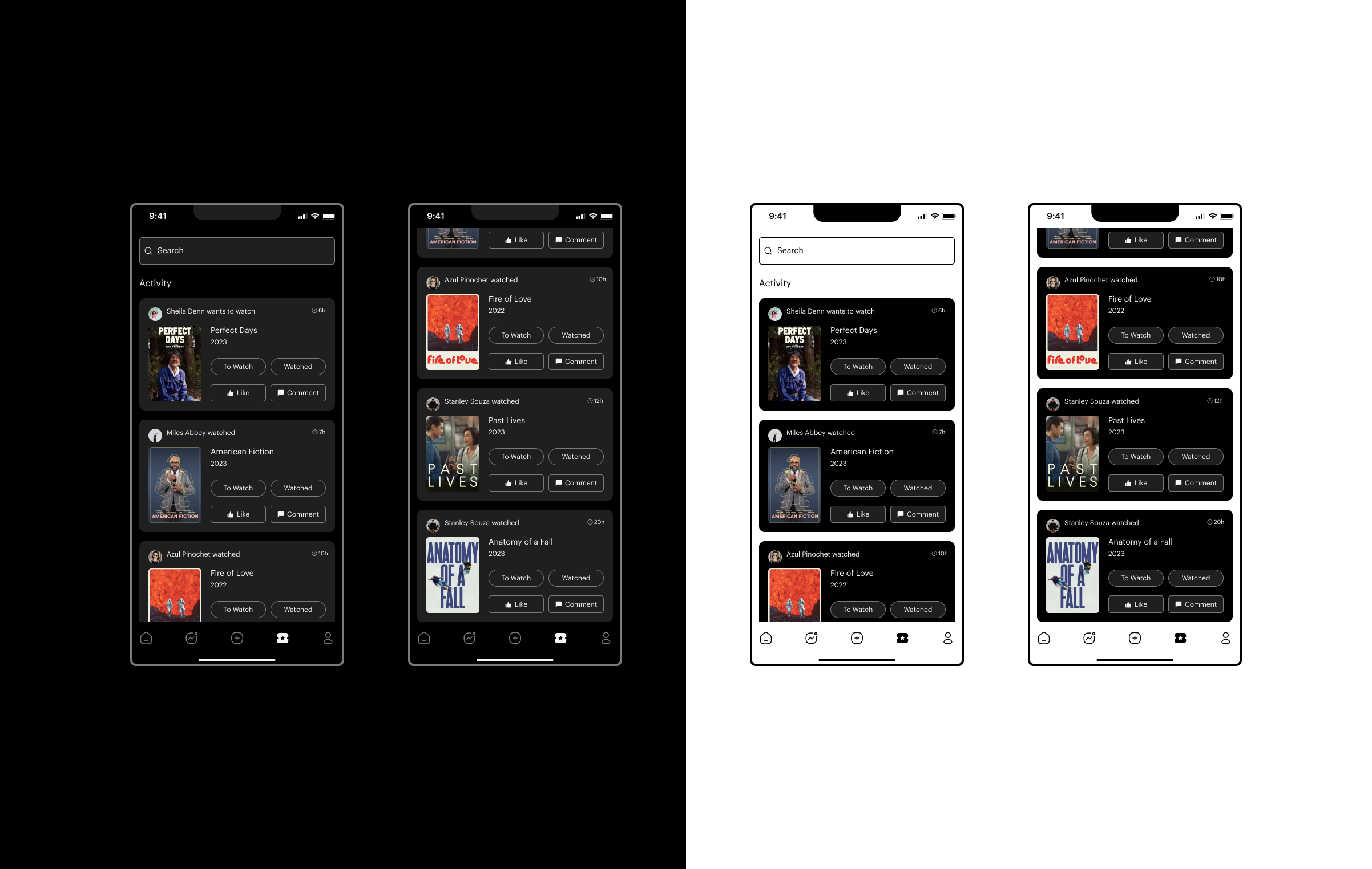
📰 Social Feed
Discover and share titles with followers and friends
The social feed was all about designing for accessibility and ease. Users can see what their friends and followers have been watching while also being able to like and comment. In adopting a simple UI, which already feels familiar, the page allows users to focus on socializing and connecting with friends.
👤 Profile
User curated library which organizes media into comprehensive categories
Arguably one of the most important pages of the app, the profile page acts at the users personal catalogue. Content is organized by category tabs with full page scrollability. From the profile page users can quickly view their entertainment library, create collection pages, analyze their entertainment stats, and access the settings page.

🎞️ Title page
Accessible multimedia content which informs but doesn’t overwhelm
The title page was designed with both the film buff and quick glancer in mind. Users can choose to watch the title’s trailer, peak top ratings, share with friends, add to a private collection, or expand the details view by scrolling through more content. In using whitespace to our advantage the title page makes accessing the information individuals want easy and effortless.

🫙 Collections
Customizable, shareable media playlists created by users
With the draw of social apps being the element of personalization and identity it was important for users to have an easy way to create and organize collection pages. Taking inspiration from Spotify’s playlist feature and Goodreads’ bookshelves, Enscene provides individuals with the ability to create collaborative, and non-collaborative, collections of their favorite movies and series. By creating multiple ways to add to, edit, or share collections users have more opportunities for creative expression and personalization within their accounts.

⚙️ Settings
Practical settings options and information
Settings was the final page to be completed within the Enscene app. Using a simple list view, users can edit personal information, connect accounts across other social media platforms, personalize their experience with notifications, report problems, and sign-out of the app. By taking inspiration from other apps the UI follows a simple and straight-forward approach making it efficient and familiar.

Explore Enscene through prototyping
Reflection
Takeaways
Enscene being a fully responsive mobile app containing many features pushed me to become a better, more efficient designer. Specifically, it posed the question - how do I organize large amounts of information and detailed features in a way that feels both intuitive and fun?
Future improvements
Based off the social component of the app I want to explore new ways it can can grow and continue serve its community. Here are a few areas that I think could be further improved upon and actions that I would take to create an even more effective product.
Further develop the social nature of the app by incorporating a messaging system; allowing users to communicate within the app itself
Continue to add unique content to the title pages
Conduct another round of user testing to identify pain points and user needs